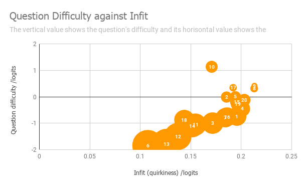
The vertical axis shows you how difficult the question is. The horizontal axis shows how 'quirky' the response was (i.e. did the high scoring learners mostly get it right, and the low scoring learners got it mostly wrong? Or was something odd going on?)