
Primary and secondary teachers, skip seductive pictures of explosions, pandas and smallpox – they reduce comprehension and learning (see here). Instead, choose visuals which enhance comprehension and teach your pupils how to read them.
Here is my first draft of a checklist of image types your pupil need to learn.
Spatial Graphics
If the arrangement or position of elements are important, nothing does the job like a diagram. However, just because you can follow it, doesn’t mean your pupils can. Talk your pupils through the diagram step by step. If there’s a text alongside, refer to both and show how they work together.
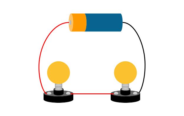
Circuit diagram taken from Primary Science in a Nutshell (Hoath and Rogers 2024)
Sequence Graphics
Scientists love a sequence. Carbon and water cycles are classic examples, as are food chains and webs. Make sure your pupils understand what the arrows represent: is it the movement of carbon or nutrients or time? If there are multiple routes through the diagram, talk through several. You could model a couple of routes through and then as pupils to explain other routes in pairs.
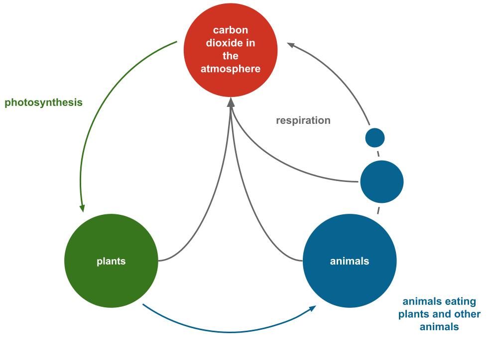
Carbon cycle taken from Primary Science in a Nutshell (Hoath and Rogers 2024)
Keys and Classification Diagrams
Classification is hugely important in science. The characteristics we use to separate one thing from another need to be very precise. Talk through the implications of this type of diagram. For example – based on the classification tree below:
- how can you find out what an animal feeds it’s offspring?
- what happens if you find an animal which you can’t answer yes/no for?
- what happens if a question has three options?

Classification tree taken from Primary Science in a Nutshell (Hoath and Rogers 2024)
Relationships between Variables
Charts and graphs are the backbone of scientific visuals. Some charts are science topic specific (e.g. a Sankey diagram), but others are very general. Your pupils will have a lot of experience in maths lessons with various charts, but still take the time to talk through each chart you come across in texts. Make sure you compare the writing to the graph… are they saying the same thing?
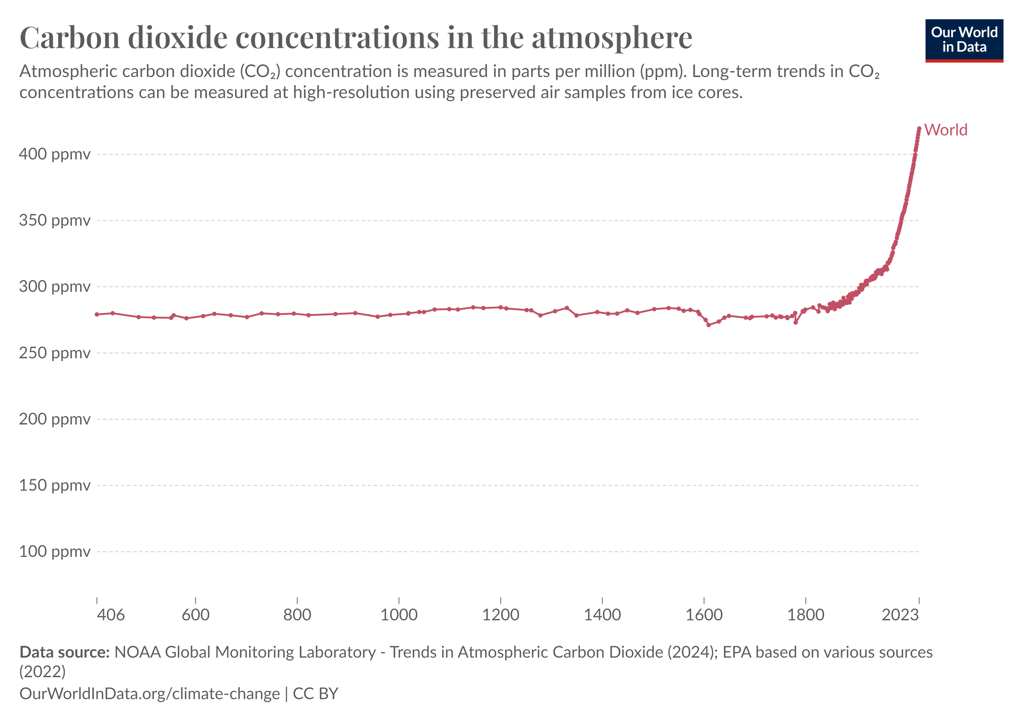
The most important graph of our times? From Our World in Data
Take Away
Whether you are teaching Y2 pupils or Y13, please use scientific texts with images in your lessons. Make sure you take the time to teach the images too.
This is just a selection – I’d argue that you need to make sure you are teaching these. It would make sense to assess whether your pupils can interpret them. If they can’t ‘read’ a visual, they aren’t literate in science texts.
Many thanks for reading 🙂
Ben
Further Reading
Critical Graphicacy: Understanding Visual Representation. Roth, Pozzer-Ardenghi and Han (2005)

1 Comment