
I wanted to give an example of how visualisations can be used to help learners get a deeper understanding of abstract concepts more rapidly. I’ve chosen as an example the specific heat capacity of aluminium. The three diagrams represent energy.
Heating a block of aluminium with an electric heater.

The energy transferred to the aluminium can be represented as a 1D bar model: The blue section represents the thermal energy lost to the surroundings. This helps explain the importance of insulating the block. (You can adapt the diagram to show percentages too if the quest says “20% of the energy is lost to the surroundings.”)
You can use a 3D representation for the formula energy transferred = VIt
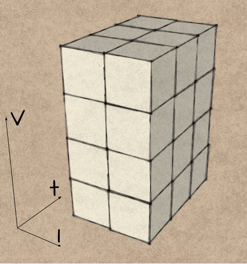
Each cube represents 1J, so a learner can easily visualise the energy depends on the three variables: potential difference, current and time.
Once you have calculated the electrical energy transferred to the aluminium’s thermal energy store, you can use a 2D box diagram to represent the variables: change in temperature and mass of the block.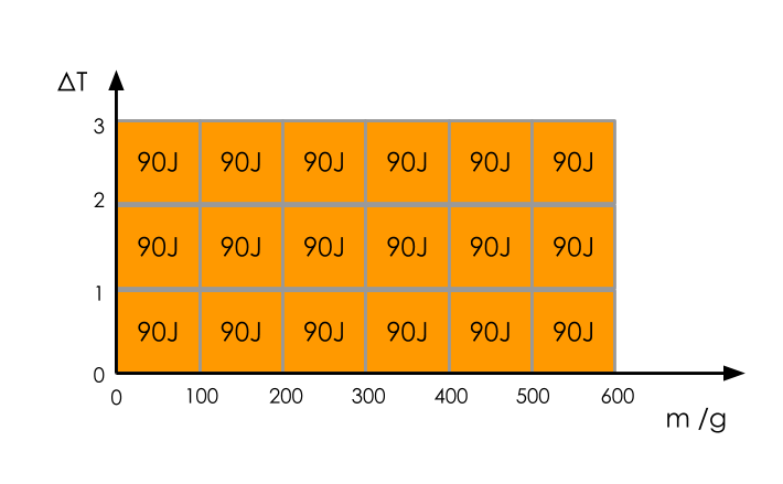 So a learner can see the energy depends on the mass of the block and the change in temperature. The relationships become transparent.
Turning the problem around, you can see that the same visualization allows you to calculate other variables: e.g. if the energy transferred is 8100J and the mass of the block is 600g and the change in temperature is 15K:

15 x 0.6 x ▢ = 1800
So the specific heat capacity of aluminium = 1800 / 15 / 0.6
= 900 J/kg/K
Making the abstract visible, lets the learner experience the relationships more easily (less cognitive load) and so the learning will be more rapid.
Thanks,
Ben
