
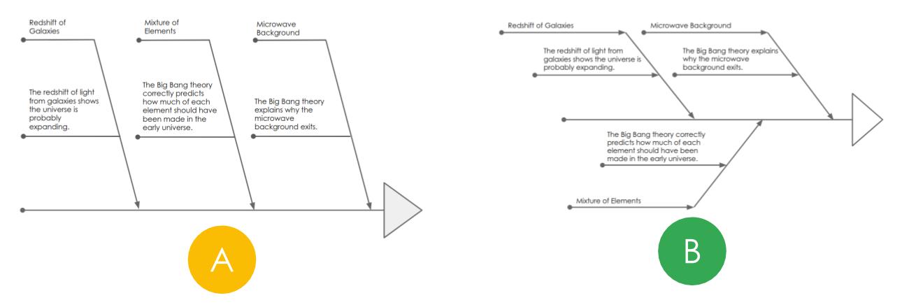
You have two different ways of representing some information. Which way is better?
One method is called AB testing. I wrote about it here.
I have now written the webapp to do this (here) – when you click on the link, you will get one of these two diagrams and a comprehension question. The website times how long it takes you to answer the question using the diagram.
If 100 people do the same task, 50 with one diagram and 50 with the other, you should be able to see which diagram is most efficient.
Please have a go.
I’ll post the results.
Ben
@benrogersedu

I so wanted to write (b) {in line with the internet meme}
As it was I got A and clicked (c)
I saw the “light”
LikeLike