
The formula ΔQ=mcΔθ tells a story. It describes the relationship between temperature and thermal energy in an elegant, succinct and precise way. But for many learners the story is inaccessible.
Another story is how the melting points of group one metals change as you down the group:
| Group 1 element | Melting Point (oC ) | Melting Point (K) |
| Lithium | 180.5 | 453.5 |
| Sodium | 97.8 | 370.8 |
| Potassium | 63.5 | 336.5 |
| Rubidium | 39.3 | 312.3 |
| Caesium | 28.4 | 301.4 |
It’s a good story, but it’s told the wrong way. It takes too much effort to uncover. The story deserves a better telling. I think it needs something visual.
Recently I’ve been inspired by Cole Knaflic’s blog and podcast ‘Story Telling with Data’ – I think this post on bar charts was the first one I came across.
I am a fan of bar charts for telling stories. But not really ones like this:
It tells a story, but it’s trivial and unsatisfying. The bar chart below is much more interesting.
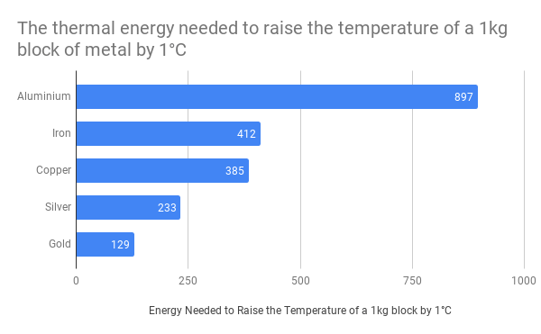
This chart sucks you in. You start asking questions:
- Why is the aluminium bar so long?
- Why does gold take so little thermal energy to heat up?
- Why is there such a large range of values?
- Aluminium is much more reactive than gold – is there a relationship between specific heat capacity and reactivity? If so, why?
- Aluminium is also much less dense than gold – is there a relationship between specific heat capacity and density? If so, why?
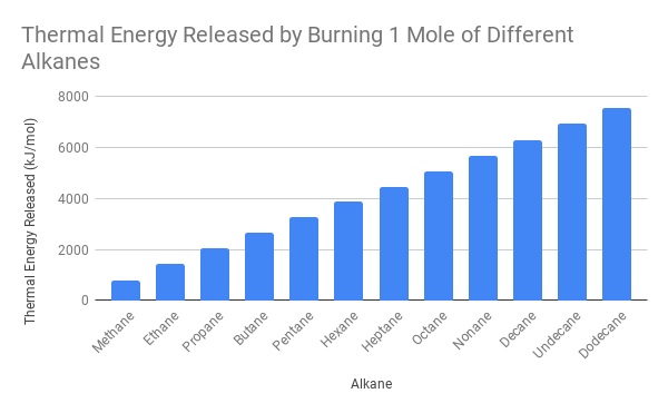
Another example below:

- Why does the lighter metal have a higher melting point?
- There is another group 1 element below Cesium in the periodic table (Francium). Can I predict the melting point?
Human stories can also be told:
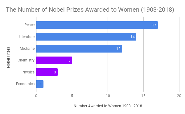
This is a stark visualisation of an important story in the sciences. (Inspired by Ratnesh Pandey here)
Hidden Stories, Revealed Stories – Choosing the Data
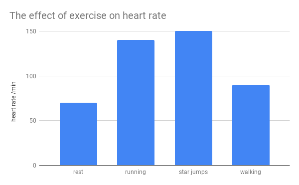
Choosing the data carefully can create more compelling scientific stories. There may be a story in the bar chart below, but I can’t see it.
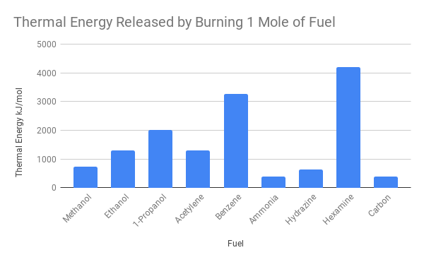
This one tells a much better story:
Data is at the heart of science, and the bar graph is a powerful visualisation tool for turning numbers into stories. It’s time to rescue it from tedious data – bring on the bar charts.
