
I am writing a week of blogs about assessment and reporting at Paradigm Trust, where I work. Today’s post is about using the data we generate.
Our Key Stage 1-3 curriculum for science, history, RE and geography has been delivered in classrooms since last November. Each subject has a network group with subject specialists, one from each school, and a balance of teachers from Key Stage 1 to 4. We wrote the curriculum together, support teachers in our school to develop subject knowledge and subject pedagogy and we write the assessments.
At the end of each until we assess using multiple choice questions. We also use comparative judgement tasks.
But why?
We use the data mostly to make summative judgements about teaching, learning and our curriculum. We want to know how well each individual has done, which teachers are delivering particularly effective lessons and where the gaps are in our curriculum.
This post describes some data visualisations we use to explore student responses.
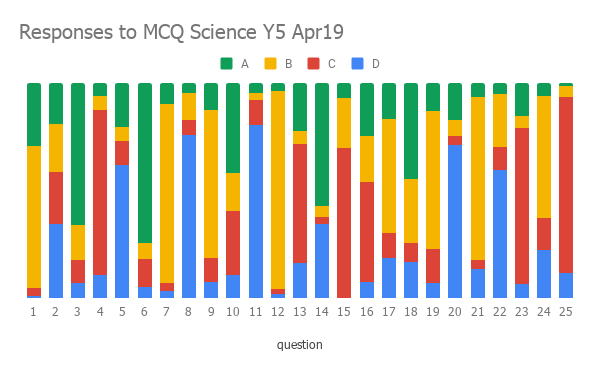

When we meet, one of our jobs is to analyse the assessment data. We have the chart above, the charts I wrote about yesterday (here) and the question paper.


We then discuss each question one by one.
- What does this tell us?
- Why did this many get it wrong? Is it worded badly? Is it too hard?
- Why is the discrimination on this question odd?
- Which groups got this question right? How was it taught?
This way, we slowly identify what we are doing well and gives us an indication on how we can improve.
Tomorrow is my last planned Paradigm Trust post for a while. It about using a more sophisticated method of analysing MCQ data in line with comparative judgement. We’ve developed a MCQ Rasch model spreadsheet, which we’re happy to share. Or you might prefer a more stable commercial package.
My thanks as always to Deep Singh Ghataura (@DSGhataura) for constant encouragement, guidance and support.
Ben
