
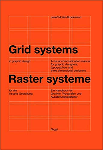
Last weekend, my friend, a graphic designer, recommended this book by Joseph Muller-Brockman. It’s central message is that text and images can be arranged on a page to make it easier for the reader. In other words – to reduce extraneous cognitive load.
The page is divided into a grid for the text and images. Text and images can take one or more cells in the grid.
Below is my attempt. It has three columns and five rows – the top row is given over to the title; the second row has separate images for each cell. The curves take two cells each and the bottom three cells have a text for each diagram.
In true Swiss Grid Style, the text is left-aligned and unjustified.
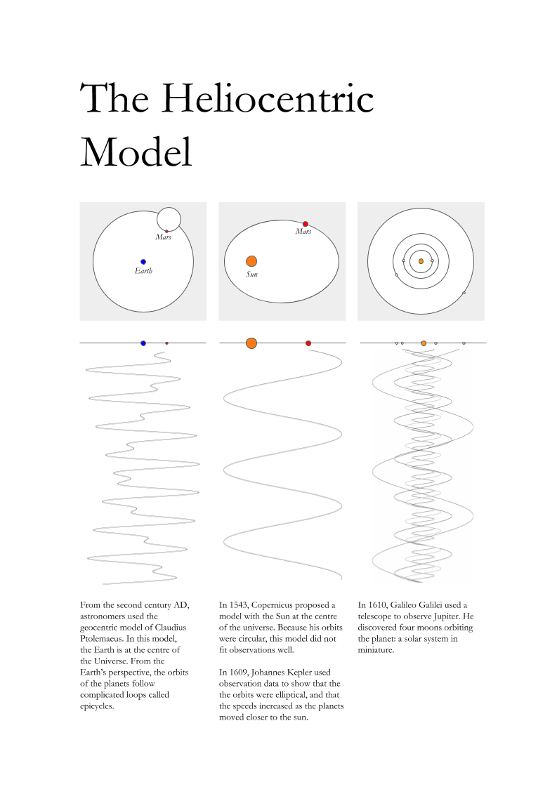
I chose the font Garamond, even through it isn’t a modern typeface: it’s 16th century. It felt right to use it with the 16th century physics. And it’s pretty classy.
I like the page, but I made too many decisions to fit the grid, instead of telling the best story I could. Next step – follow the Bauhaus formula: “form follows function.” Or, “The solution to the design problem should emerge from its content.” Ernst Keller.

I absolutely love what you’re trying to do here Ben. Following your blog with interest!
LikeLike
Thanks!
LikeLike